Clinside
Streamlining Clinic Management for Brazil's Underserved Regions
HIGHLIGHT
Through a user-friendly and simplified platform, Clinside reduces manual tasks and bureaucratic processes helping healthcare professionals prioritize patient care.
ABOUT PROJECT
Our team designed Clinside, a web-based EHR software for optimizing clinic management in underserved Brazilian regions, with a 2-year process including MVP development and post-launch iterations.
MY ROLE
- Conducted user research and usability testing to identify pain points and guide design decisions.
- Designed intuitive, accessible interfaces with user flows, wireframes, prototypes, and high-fidelity UIs.
- Collaborated with cross-functional teams to deliver user-centered and seamless product solutions.
- Refined designs through iterative prototyping and performance-driven improvements.
- Led end-to-end design, aligning user needs with business objectives.
CHALLENGE
How might we improve the management of patient health data and streamline clinic operations to enhance efficiency and service quality?
Many clinics in underserved regions rely on outdated, manual methods for handling patient records and appointment scheduling. These archaic systems lead to frequent errors, inefficiencies, and lost data, ultimately delaying diagnoses and treatments.
PROBLEM
Streamlining clinic workflows and ensuring real-time integration for patient and schedule management.
The absence of synchronized schedules and centralized patient databases for professionals working across different locations creates significant inefficiencies in the quality of service. Physical appointment books and disconnected systems result in labor-intensive processes, scheduling errors, and fragmented care, affecting the delivery of effective healthcare solutions.
USER INTERVIEW
After interviewing doctors, nurses, nutritionists, pharmacists, and receptionists, we aimed to understand their unique challenges and workflows.
While existing systems had benefits, we deeply analyzed each role's tasks, challenges, and workflow inefficiencies to identify improvements. We also evaluated how current solutions impact their work, guiding the development of a user-focused system tailored to their needs.
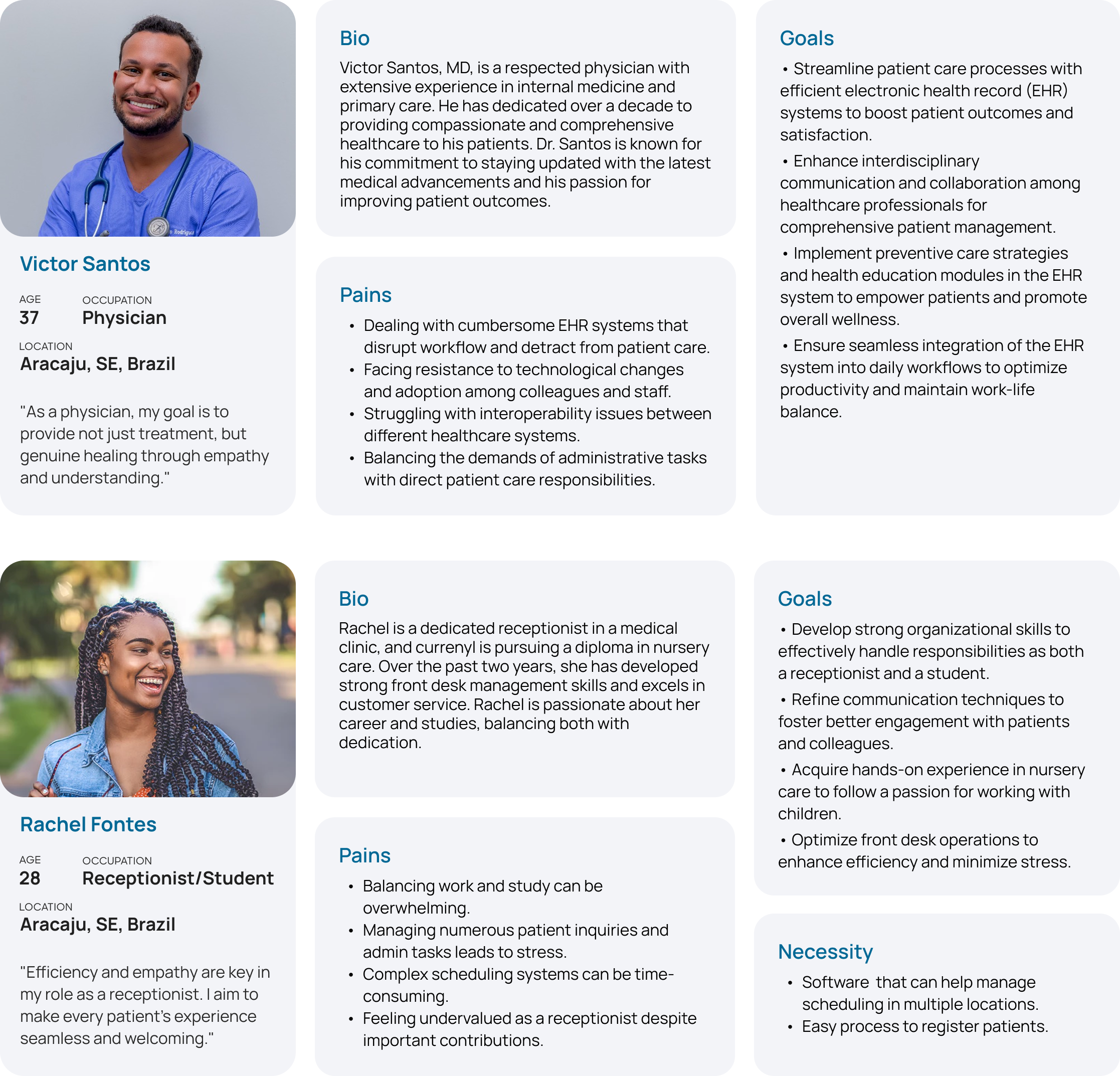
USER PERSONA
Using interview insights and participant demographics, we created two personas that guide our solution development.
DESIGN STRATEGY
The focus was to provide a system that could be easily adopted, especially in regions with low technological adoption.
As mobile device usage continues to increase, there is a growing need for solutions that address the health impacts of poor posture. By utilizing smartphone capabilities, we can create an app that encourages healthier habits and helps reduce the risk of neck pain.
CONCEPTUALIZATION AND SOLUTIONS
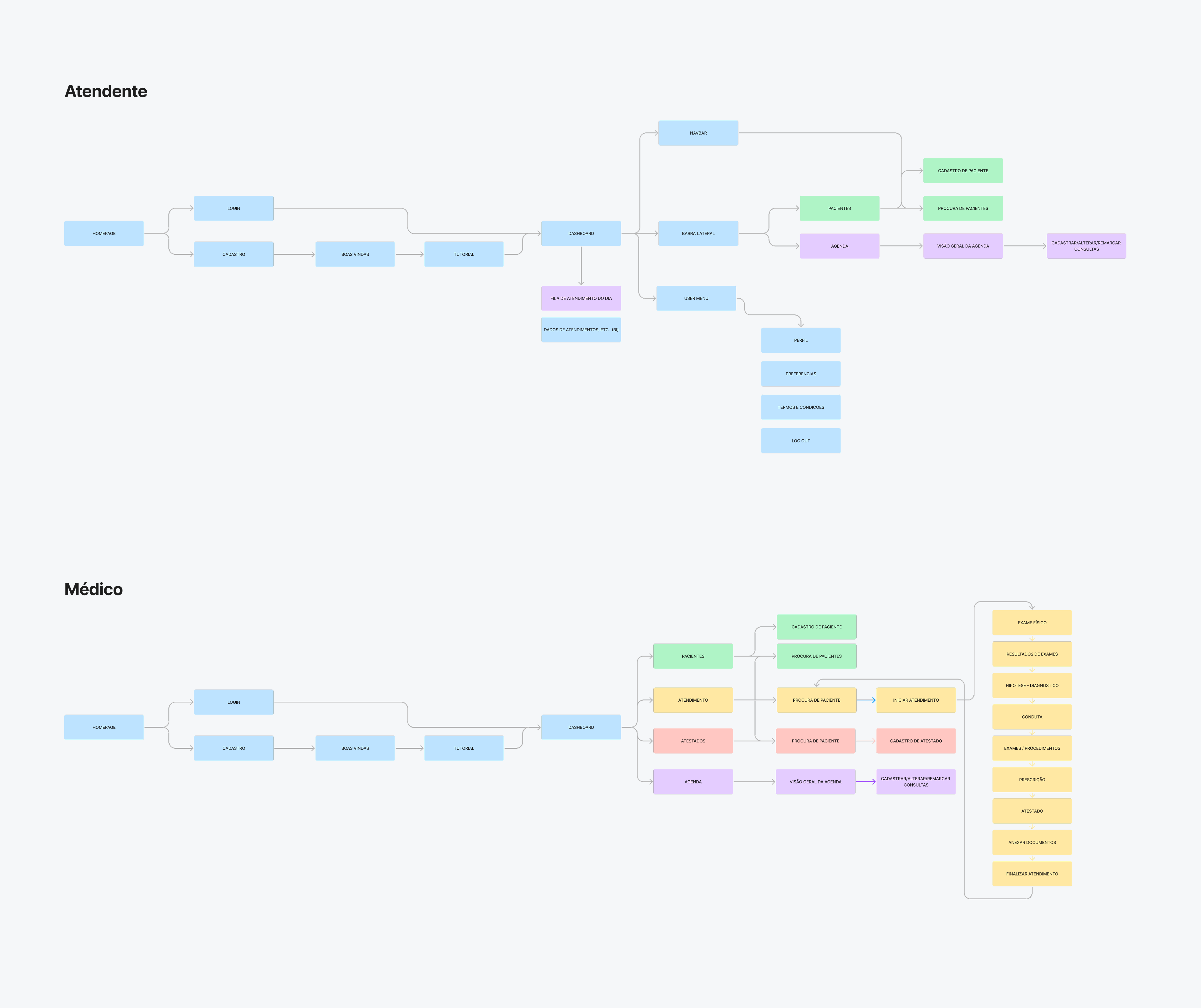
In the conceptualization phase, we focused on mapping user flows to align with users' mental models, ensuring intuitive navigation and interactions throughout the app.
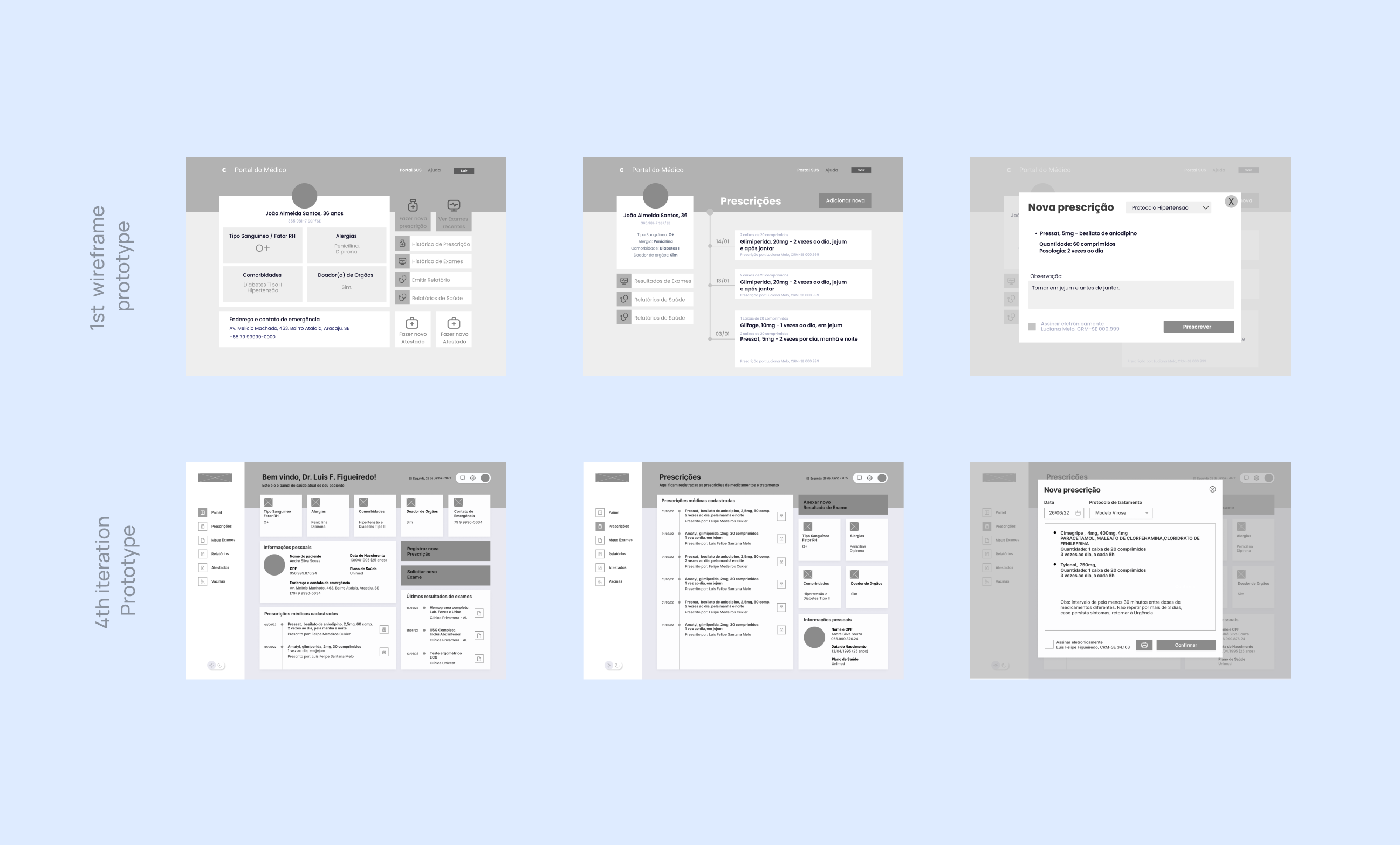
WIREFRAMING AND TESTING
Wireframing focused on app structure and functionality, tested with real users to gather insights and refine the experience.
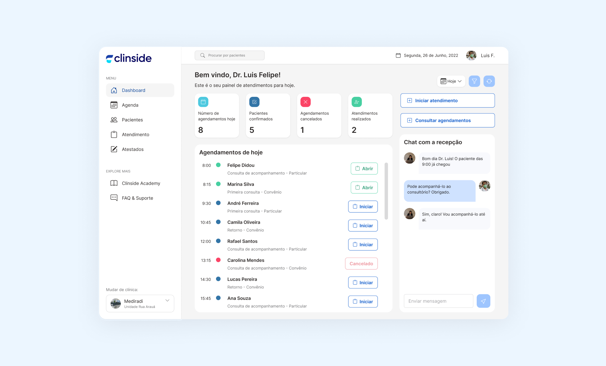
SOLUTION
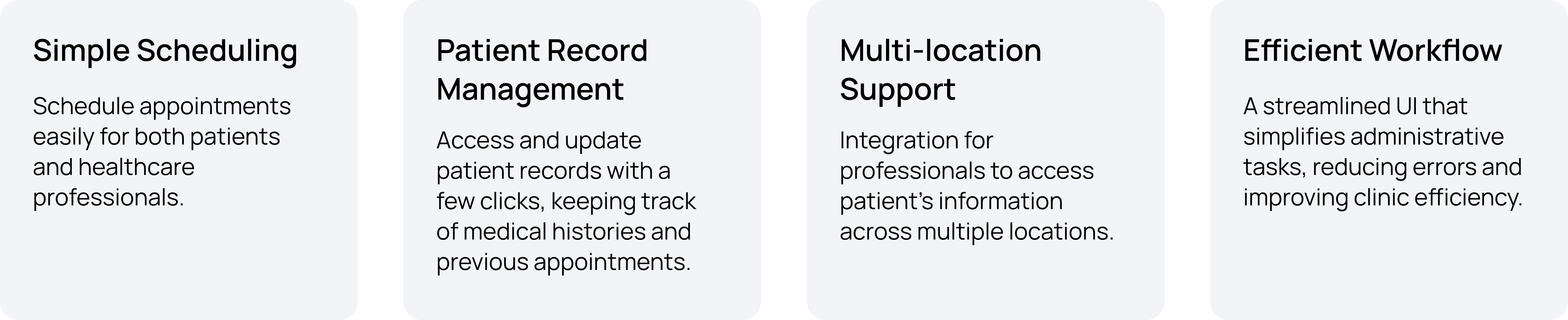
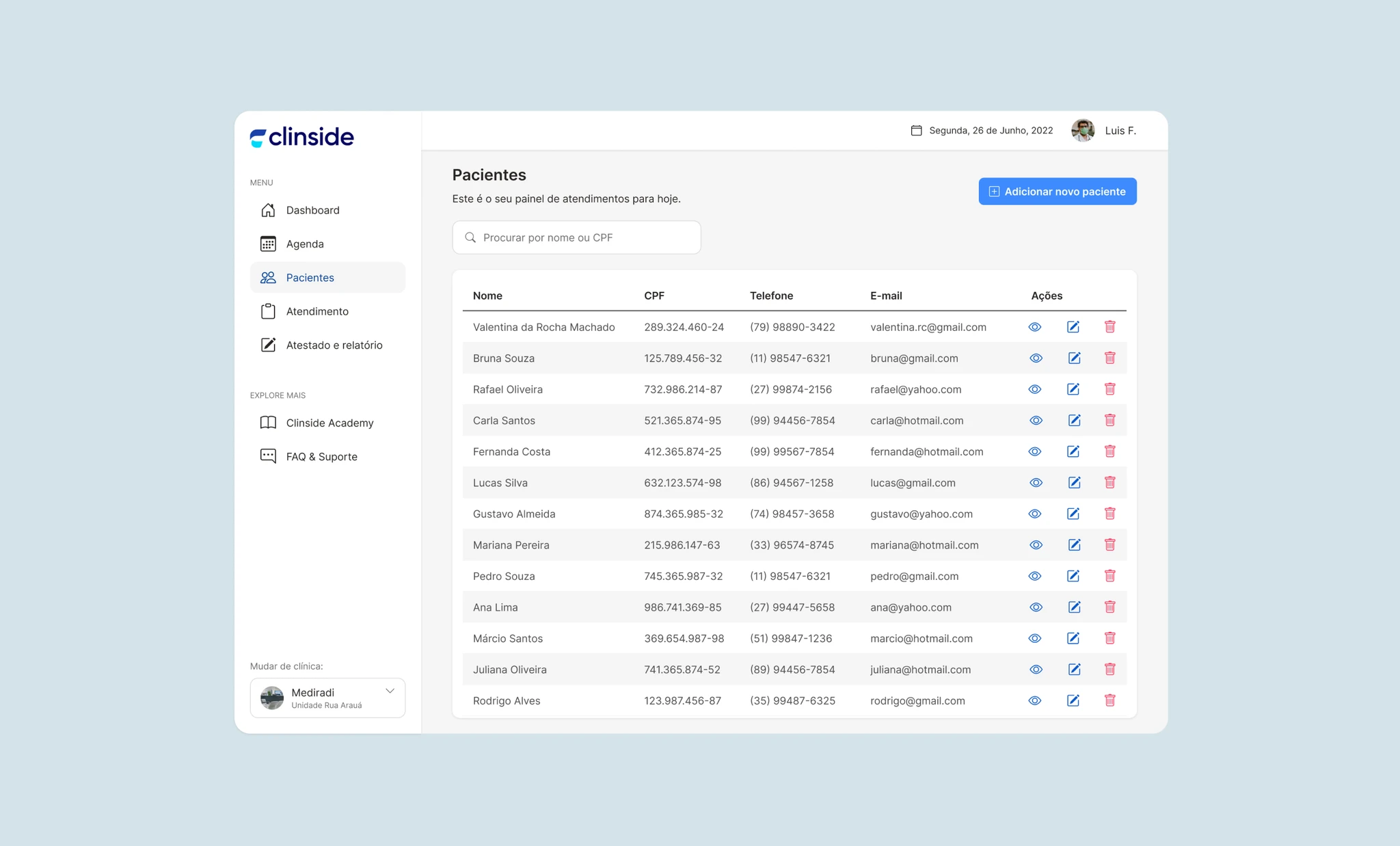
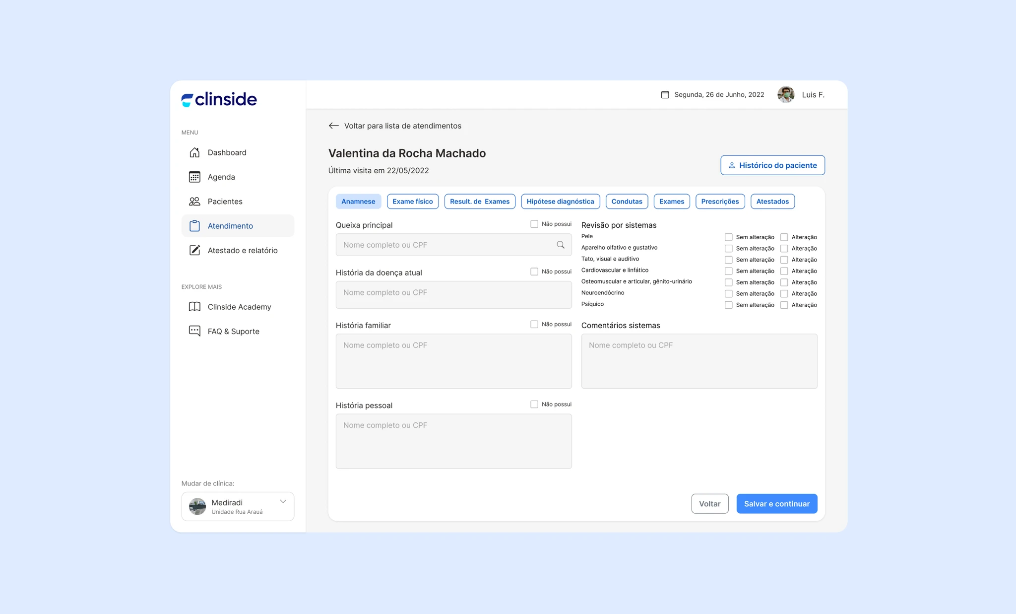
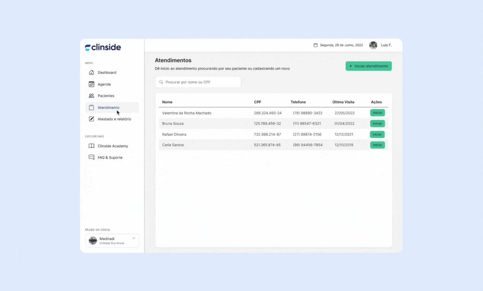
Clinside revolutionizes clinic management by streamlining appointment scheduling, organizing medical data, and maintaining detailed consultation histories.
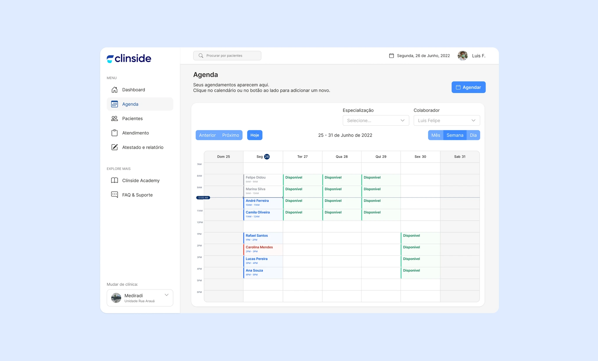
Clinside centralizes workflows into a simple, user-friendly agenda for managing appointments and records efficiently. Designed for professionals working in multiple clinics, it streamlines organization, reduces stress, and allows more focus on patient care over administrative tasks.
MAIN FEATURES
Clinside revolutionizes clinic management by streamlining appointment scheduling, organizing medical data, and maintaining detailed consultation histories.
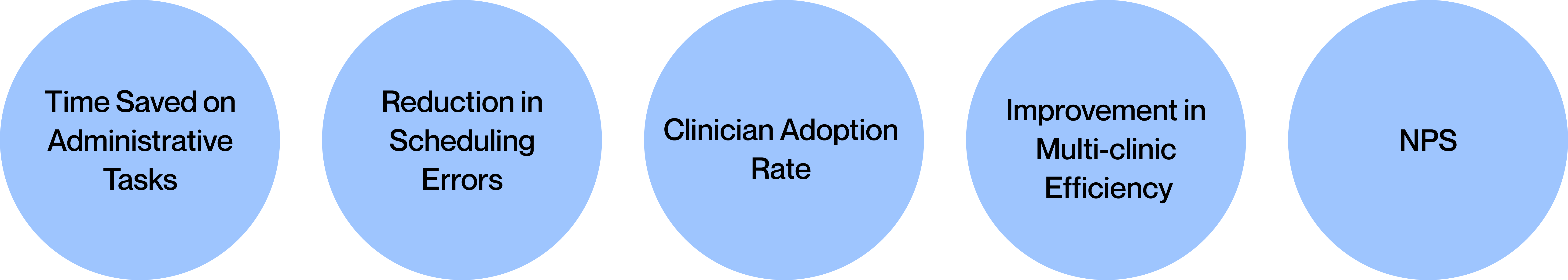
SUCCESS CRITERIA
The success of our product will be measured by its ability to simplify clinic workflows, enhance patient care quality, and drive time savings for healthcare professionals.
MY TAKEAWAYS
User Testing helped refine key features
In our initial designs, some of the features were confusing for users, such as the way patient data was presented. Feedback from user testing led to simplifications that improved the overall user experience.
Collaborative design is essential
Close communication with developers and stakeholders ensured that our design was feasible and aligned with the project’s technical and business goals. Regular feedback loops helped us adapt the design quickly.